

A New Face in a
Trillion Dollar
Industry
Veho Design System
Overview
As a product designer leading the Consumer vertical of Veho, I—along with a lean team of other product design leads—leveraged initial brand assets from an external agency and built a scalable design system made to service both public-facing surfaces and robust internal tools.
Problem & Goal
The earliest version of the Veho identity was purely focused on functionality and not only neglected the importance of having a unique presence in the fairly-dominated world of shipping logistics, it neglected the importance of having a unified voice.
Veho as a company, served as a disruptor to a trillion dollar industry, enabling anyone the freedom to choose their own schedule to deliver packages for either their primary or supplementary source of income. The interface of both their consumer-facing and internal tools were built and optimized for the initial speed of development, rather than an optimal user experience or for scale. The tools had some similar characteristics with colors and fonts, but didn’t leverage consistent components across platforms. It worked, but wasn’t intuitive or pleasant for users and not flexible for engineers to apply practically across systems.
Veho’s former logo identity. Image courtesy of Jacksonville Daily Record
As Veho began to scale and position itself as a named player in the logistics space, the need to forge a unique brand identity became increasingly necessary. The question we asked ourselves was: how might we—as an emerging and promising startup—make a lasting impression to consumers and driver partners alike, amongst logistics titans, such as FedEx, UPS, and Amazon, while creating a flexible design system that enables engineers and designers to deliver quality experiences, faster?
Process
By the time I had joined in 2023, Veho had hired a design agency to create the foundational artifacts of Veho’s new visual identity, with a refined static logo, typography, and color palette. My first day at Veho was focused on standard onboarding and understanding the nature of the business at a high-level. By my second day, I was tasked with designing the Veho homepage and Consumer Web Tracking Application with these new, foundational brand elements, while creating and stress-testing new design system components that had more enterprise-level applications.

Initial brand elements provided by an external creative agency.
Needless to say, I was hitting the ground running.
Although I was eager to immediately put pen to paper, I wanted to better understand the overall vision of Veho from various perspectives. During my first days, I prioritized making space to connect with folks from all different areas of the business. A 15-30 minute coffee chat with someone who has years of institutional knowledge can prove to be a more effective and authentic way to gain organizational context, rather than flipping through libraries of swiftly outdated product documentation. In short, it was critical to get an authentic account of where we are as an organization, and document each person’s perspective of our ideal future-state position.
One pivotal conversation I had was regarding the future of the online shopping experience as a whole; Veho’s niche of gig-economy last-mile shipping logistics took a backseat. The real vision was the post-purchase experience, entirely reimagined:
What if you could shop around, check out an item of clothing, try it on, and decide to keep it in your closet or bring it back to the store, all within the comfort of your home? What if you could bring the benefits of shopping in store without ever leaving your front door?
We had also talked about the possibilities of refactoring our route-planning algorithm to optimize driver paths beyond the standard “pick-up-only” or “deliver-only” routes, and instead build “blended routes,” which would blend both deliveries and doorstep pickups to maximize efficiency based on vehicle capacity.
With each small quarter-hour investment, the snapshot of where we are and the vision of where we were headed got sharper and brighter.
Rough animated prototype of the floating action button component, co-created with Sabin Arditty and Sean Andersohn.

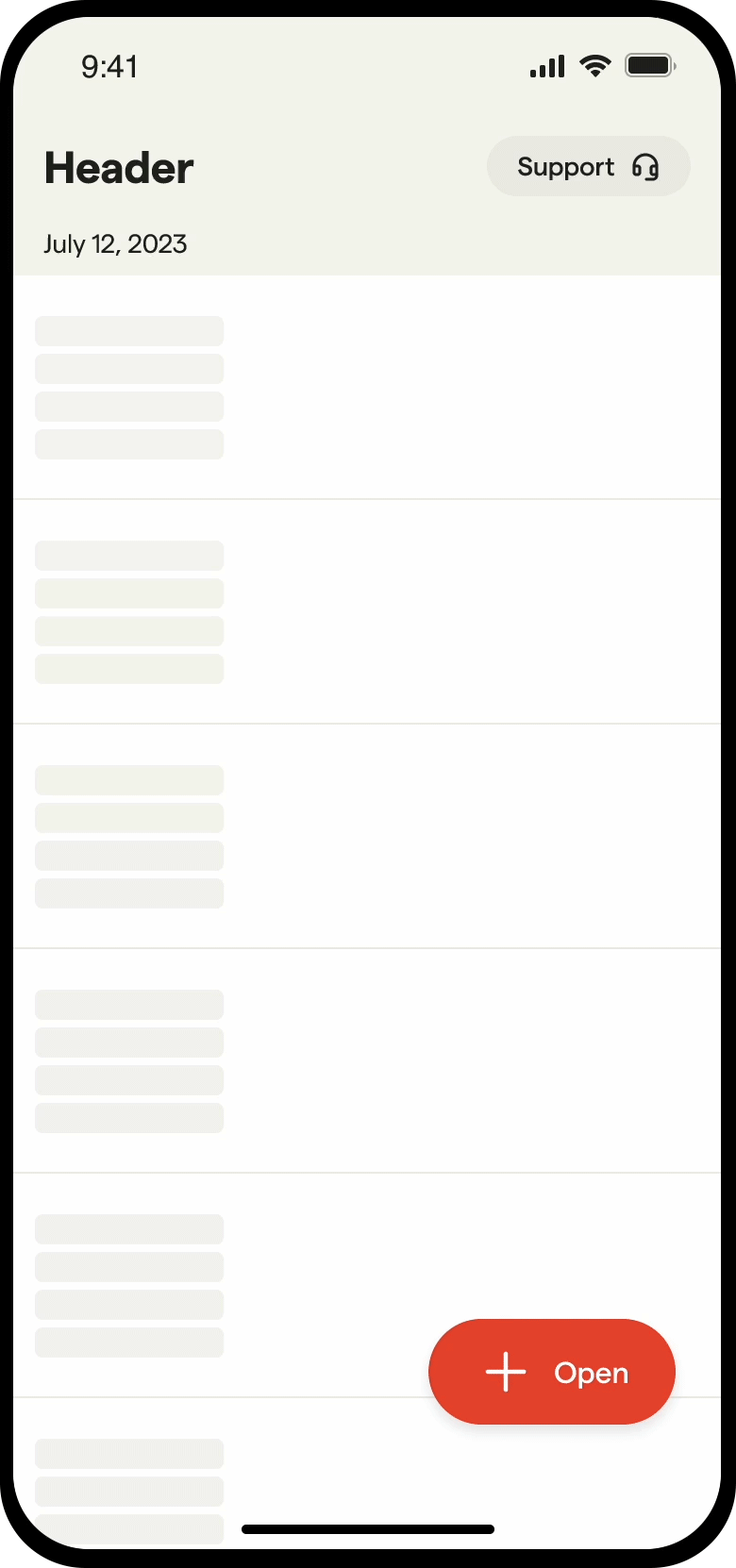
Figma documentation of Veho’s button, slide to unlock, and floating action button components.
While it was essential to first create the foundational atomic elements of Veho’s design system, our team had to create a practice of continuously zooming out and aligning our work to a forward-thinking future, while not feeling confined to that vision.
As simple as our atomic components can seem, we had to make sure that we continuously stress-tested their adaptability in different settings and how they worked nested within more complex components. We collaborated closely with Engineering partners, establishing a relationship of co-creation and encouraging candid feedback early and often.
Rough future-state prototype of Veho’s Perfect Placement feature, showcasing the button variants within the Order Summary component.
Results
As our design system grew, our teams saw a significant reduction in both design time and engineering build time. Within the first three months, our team was able to ship over 40 components—from atoms to pages (see Atomic Design by Brad Frost)—for applications ranging from mobile devices, to desktops, to tablets, to even Zebra scanners. Our teams were able to improve our consistency across all of our platforms and tools and build more enhanced user experiences with less time spent.
By establishing a tactical and adaptable design system, we were able to test new ideas faster, leveraging flexible components to rapidly prototype transformative solutions for our users and partners.
Logo animation I created to highlight Veho’s role from the package to the recipient.