Reimagining
Decision Making
Morning Consult Product Page Design
Problem & Goal
After an informative comprehensive user audit, Morning Consult found that with their current Brand Intelligence product page design, a significant portion of their audience weren’t getting the answers they wanted as quickly or effortlessly as they wanted. After a large-scale brand refresh, coupled with long page load times and design elements that looked clickable but weren’t, the product page was due for a strategic redesign.
Rather than hyper-focusing on a solution for right now, our goal was to create for flexibility and longevity.
Process
Our team performed several tests including a heat-map report and competitive landscape research on how to build a new product page using Wordpress content blocks that served our purposes, but were flexible enough to easily have use cases throughout our site.
We used Crazy Egg’s tool to run a 60-day test on our current Brand Intelligence product page, tracking how our audience interacts with the page and where our page performance can improve.
Results from the 60-day audit of our old Brand Intelligence Product Page:
1,471 visits
3,464 clicks
827 dead clicks
1,606 rage clicks
Our team found that although our product marketing page looked cutting-edge with interactive animated elements and abstracted illustrations, the site itself was confusing and hard to navigate for a large fraction of our users. As the saying goes: nothing gets duller more quickly than the cutting-edge.
Although the product page design needed a general visual design update to reflect the latest Morning Consult brand refresh, fundamental design changes needed to be implemented in order to make our site more accessible and easy to navigate.
Solution
I was able to design a clean and simple page that markets Morning Consult’s Decision Intelligence product in a way that allows our users to get the data they need as soon as they want it, without the fluff that confuses our audience or delays our most vital information.
Before
After
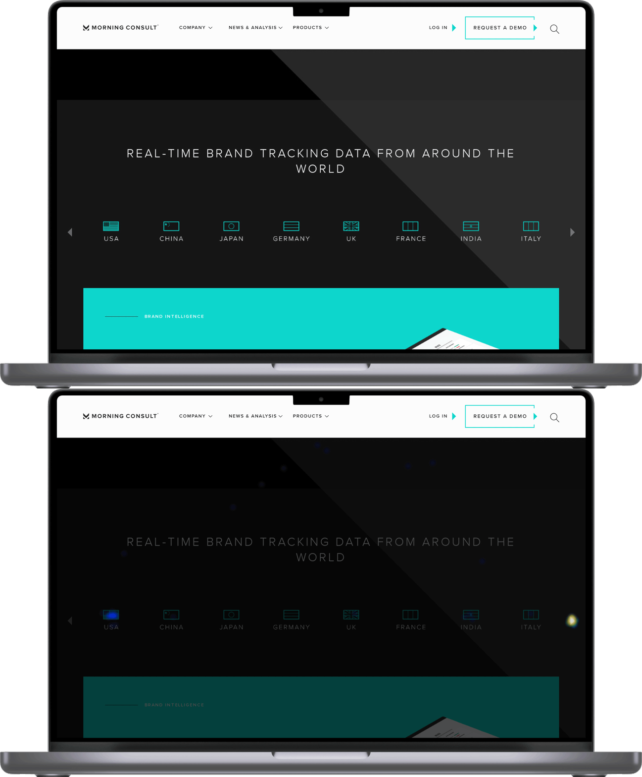
For example, according to our heat-map test, we found that a large portion of our users clicked on the flag icons that were displayed solely to list various countries our product surveys every day. Based on competitive landscape research, I found that a lot of other websites use design patterns like the ones we employed for the flags as clickable icons. I decided to simplify the design by making it abundantly clear what was clickable and what was simply live text. The redesigned layout also allowed for our content to be more evergreen, rather than relying on our content team to routinely update and add or remove all of the countries we reach.
Before
Our users clicked on the right arrow to view more countries as expected, however, many clicked on the USA icon expecting to be directed to a new page.
After
Unlike the old product page, which hid vital copy under hover states and utilized confusing graphic elements that looked clickable but weren’t, we opted for a cleaner, more approachable design that left all the animations to video and graphic components. Any copy that was crucial to demonstrating what Decision Intelligence was stayed as live text, and any text included in illustrations were non-essential and only served as contextual graphic elements.


