An immersive
storytelling
experience
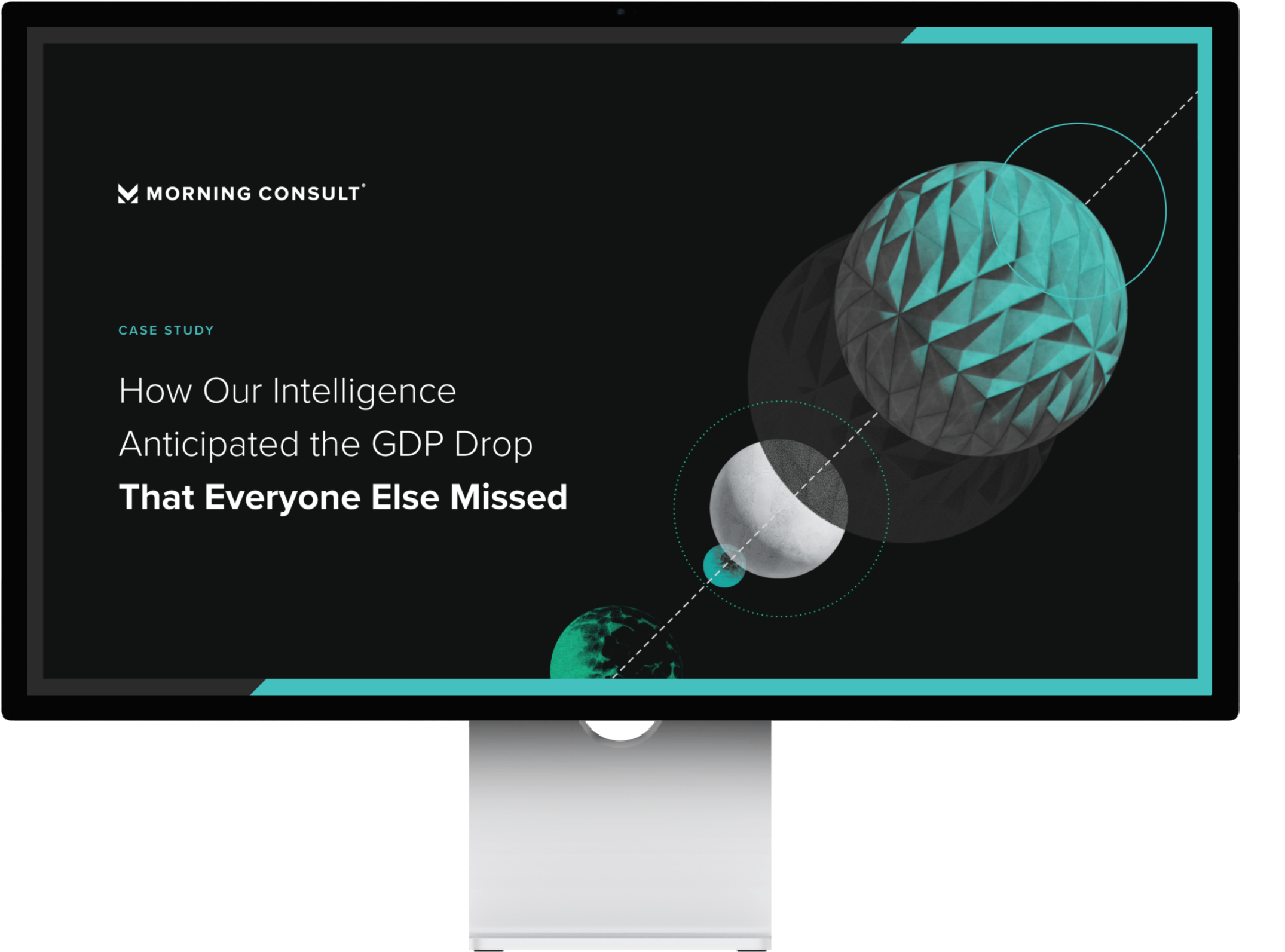
Morning Consult GDP White Paper
This was an interactive PDF I created that illustrated Morning Consult’s predictive data and how that could help our customers’ businesses. Our team decided to test the idea of using an interactive PDF for our report campaigns, based on overwhelming feedback that our customers liked the interactive storytelling of our report landing pages, but wished they could easily email or print them out and distribute them to their executive leadership and corporate partners.
The white paper takes our audiences on an immersive storytelling experience, showing how Morning Consult’s data helped predict the GDP drop five weeks before the Commerce Department’s confirmation in 2021. In short, Morning Consult’s data was incomparably fast without sacrificing accuracy.
Since the topic of this white paper was primarily about predictive analytics, I wanted to ensure that the design elements I included throughout this piece lent itself to this complex subject matter.
“Predictive analytics is a branch of advanced analytics that makes predictions about future outcomes using historical data combined with statistical modeling, data mining techniques and machine learning.”
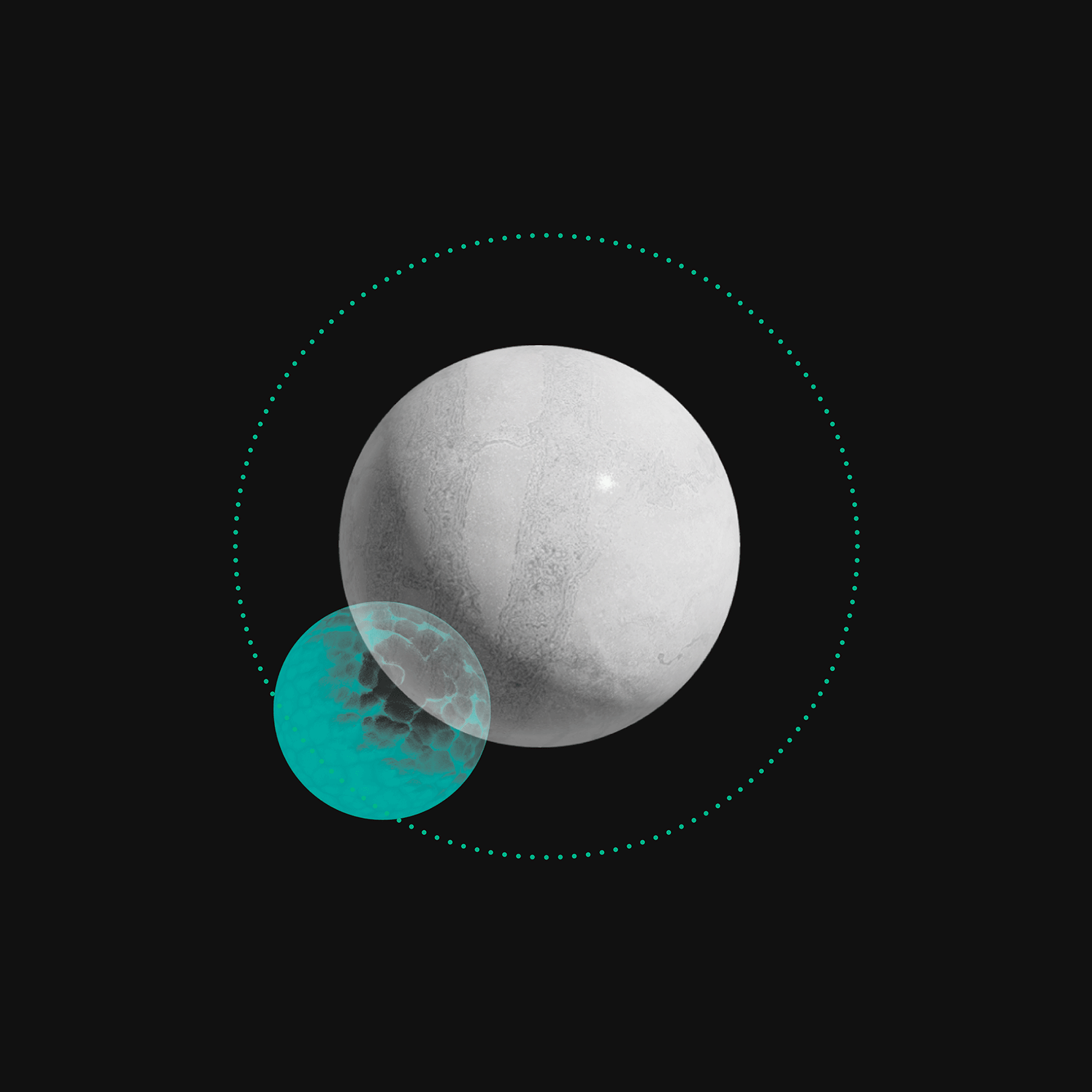
I used this as an opportunity to challenge myself in making 3D objects using Adobe Illustrator’s latest published features. Although very simple, these abstract objects were a blank canvas that supported the central concepts I wanted to highlight.
These objects were kept abstract and simple, in order to best support the content without distracting our readers. These spheres were designed to look heavy to allude to the gravity of the topic and how the data has importance on a global scale. The spheres were often placed on a dotted line as if they were data point markers, showing the trajectory of the predictive analytics. (Data Visualization best practices state that lines on a graph should be dotted if it is projected data, and solid lines if it is actual trend data.)
Overall, it was an exciting project to lead the creative execution for. I took this project as a vehicle to challenge myself on learning new tools and features, while designing a digital experience that best served our customers.


